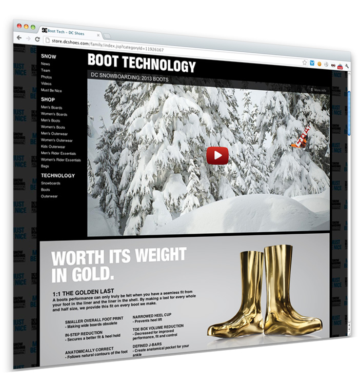
Been awhile since my last post (we do projects on like a weekly scale here) and I realized I haven’t posed about DC Snowboarding.
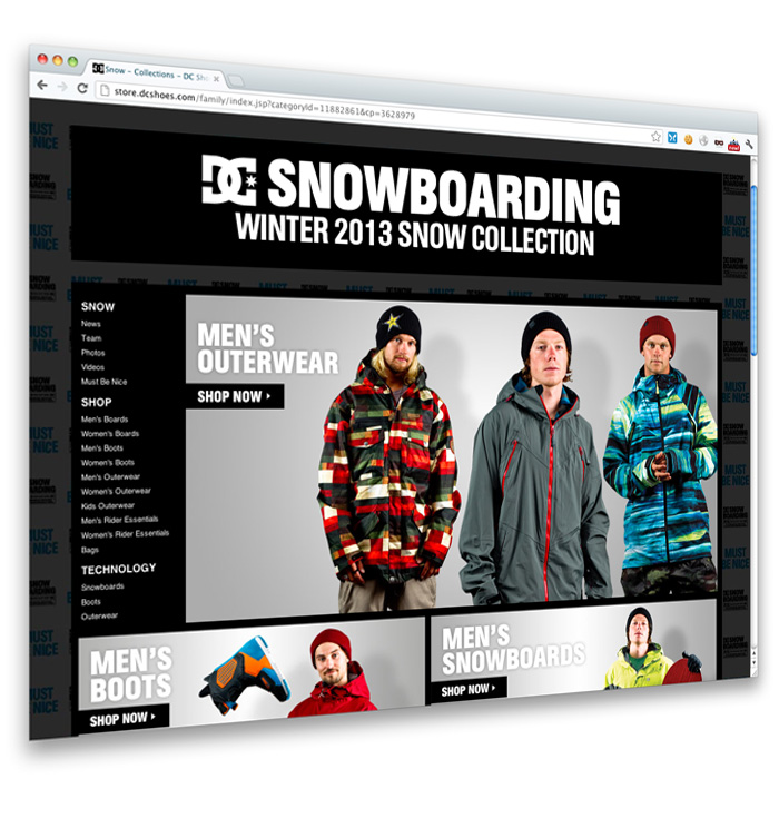
Every year DC comes out with its Snow Collection, ranging from snowboards, boots, jackets, etc… With the launch of the new collection, we always launch a new website to showcase the features of the products. We launched this on September 10th, about a month ago. I had a really fun time enjoying this project. The project was phased out into 2 main areas
- Boots Tech Pages (http://store.dcshoes.com/family/index.jsp?categoryId=11926167)
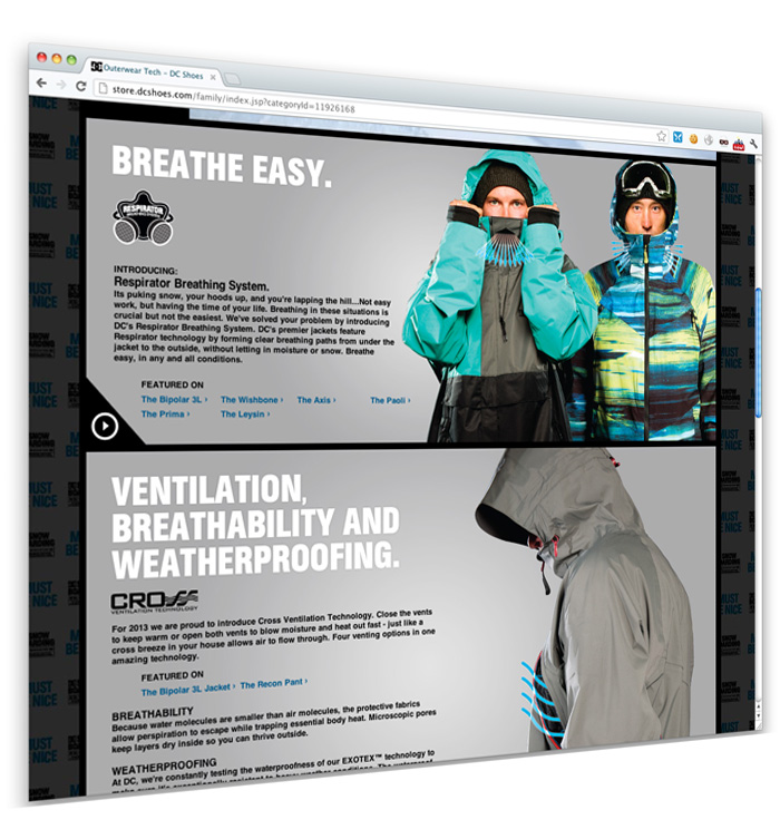
- Outerwear Tech (http://store.dcshoes.com/family/index.jsp?categoryId=11926168)
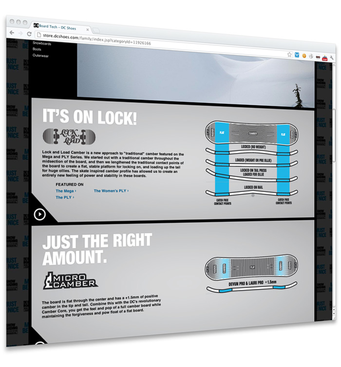
- Snowboard Tech (http://store.dcshoes.com/family/index.jsp?categoryId=11926166)
One key focus we had was to showcase tech features and videos but not jump the user up and down the page. If you notice in the tech pages, theres a big video player at the top. We were originally going to have this be the main video player, and as you clicked on a block it would scroll you up to the top, and play the video.
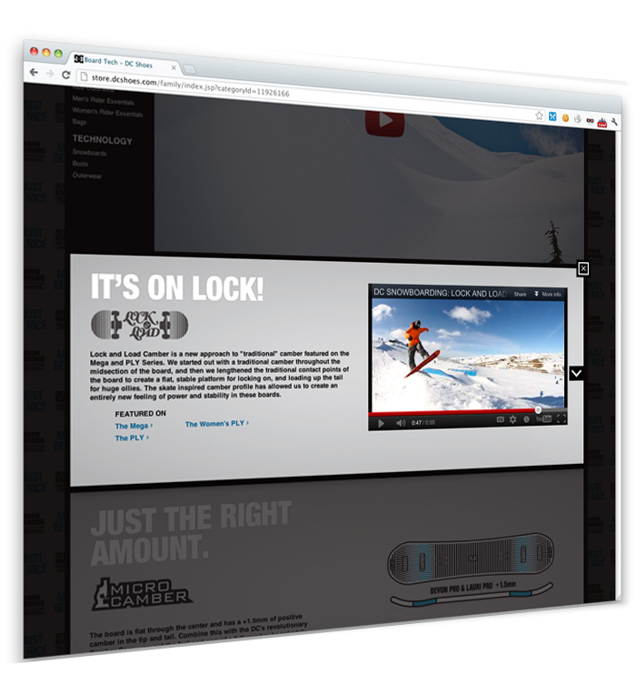
What I decided to do however was to popup a custom dialog box to the user that still has the following
- Feature Headline
- Feature Video
- Product Links
- Directional Arros
This allows the user to see the features without getting jumped up and down. If you click an arrow, you can see how the page behind does the scrolling, kinda cool huh!?
Anyways, take a look at the pages, I really enjoyed building them!
And this shows a screenshot of when you click a feature block
