One thing that I like doing when I work on websites is to add a lilttle bit of light and some texture. If you haven’t noticed, more and and more websites are starting to pop out more, have more feel to them. This is because many designers arent just using standard text on top of flat backgrounds. They are adding in colors, gradients, shadows, bevels, the works. Here’s a quick write up that shows a before and after.
Back in the 1900s, websites were basically garbage and purely information based because that is all the internet could sustain. People didn’t have cable modems or high speed internet. There was a phone jack, AOL, and the most annoying sound you’ve ever heard in your life while you would connect to the internet. Just think, back in the day it was “pay per use” internet, not even unlimited!
Because the internet was so slow, images had to be super-duper tiny and used only if absolutely needed. On a 14.4 dial up modem, the images would load block by block. Just think, on a 14.4 kbps modem, that would load approximately 1.8 kBps in download speed. The Google Image that exists today is around 26 kBs in size, so if you were on a 14.4 modem back in the day (late 90s), and went to todays version of Google.com, the google logo would take around 20 seconds to load!
The faster and faster the internet became, the prettier and prettier it got. It’s just like with video games, how as time goes by and the better and better technology got, the better and prettier video games got. The same goes with the internet. I remember the days when I would have to code for an 800×600 computer monitor because that was the norm. Now I don’t even know where I could find such a piece.
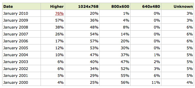
Check out the display statistics over the last 10 years.
The majority of web users are using a monitor with a resolution higher than 1024×768. This is an amazing statistic and highly overlooked. Our day to day technology is rapidly increasing and to the general user, they would never know about it.
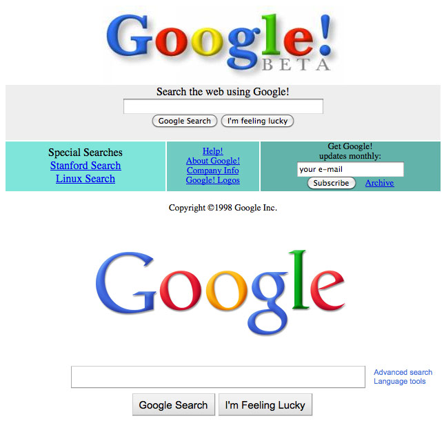
Let’s take a look at the evolution of the Google Logo, dating from December 1998 to today, October 2010.

Talk about a change. It’s must more cleaner, clearer, the colors stand out more, everything!
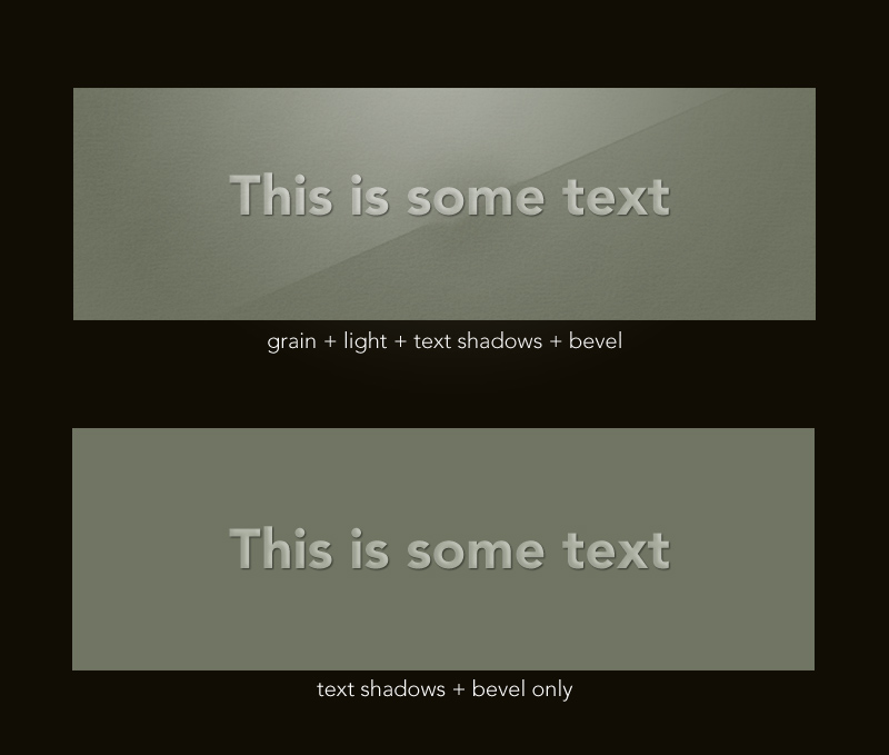
So what can you do? Well, one thing I like to do now is add in some lighting, textures, gradients and shading. Below I will show you 2 pictures. Both are the same except one has light grain texture and some lighting, and the other one does not.
You can see that the one with the lighting and grain has more of a “feel” to it. It gives in some ways a sort of 3D ish feel. This is a quick example mind you, so don’t go criticize me that the lighting levels and angles are off.
Before with the internet, we never would’ve been able to product such images. We could only have raw text. The only things we could do was modify size, font type, and color. Now the doors are basically blown in regards to design and development. There still are some issues as I pointed in an earlier post regarding Typekit, but these issues aren’t anything like the issues that we designers had back in the day.
It’s an ever changing internet. With the advent of HTML 5, Flash could be in jeopardy. When I was a juinor in college I worked for The Walt Disney Company as a Flash Animator. What if that job is now obsolete?
The one thing I know is that I have to keep up with the game. Because I’m both a designer and developer, I have to keep up with the latest trends in two areas. The design world is getting better and better and I have to step my game up and make my sites look better and better, and I’m happy to say they are. Every website I build is prettier looking than the one before it. The development world I feel is growing really fast, I feel like I’m constantly learning or studying. I do love what I do though which makes it pretty sweet.
The hardest part I’d say is the many ways you can get from Point A to Point B regarding websites and the completed product. They may all look the same to the general user, but at the core it could be basic HTML, custom PHP, ASP, JSP, a CMS like Drupal, WordPress, Joomla!, Plone, they could use regular Javascript, jQuery, mootools, scriptaculous, it they could be using some type of make your own shindig. They could have Flash thats in Actionscript 2, Actionscript 3, using a library such as Caurina Tweener, etc…This is the hard part, keeping up.
And that is what I do.


James, I found the browser resolution statistics quite awesome (and surprising). When are you going to start formatting & blogging some code I can steal? Thanks for the read man.
what do you do to keep up with youth and emerging trends?
where do you read?
what do you listen to?
I basically just visit a bunch of websites. The key thing to do is to BOOKMARK. I always thought bookmarking was stupid growing up but ever since I started bookmarking stuff, it feels like I run out of internet on an hourly basis.
NOTE: when you run out of internet, you find yourself clicking “refresh” over and over but nothing changes.
and Jason, I’m actually working on some HTML 5 stuff. Its slowly but surely.
Good to hear (regarding HTML 5). I am still working with Drupal 6 on the daily & find myself slowly integrating more & more HTML 5 features, mostly by $hook.
Keeping up! That’s what constructing a good team is all about.
This site is 1 of 12 total bookmarks I have. It seems we have to bookmark, then organize, then browse to. I like the idea of type ahead bookmarks, right from the address bar = )
P.S. – http://mashable.com is an acceptable tech style blog & is also mobile friendly.
HTML 5 is the future, gotta learn it.
I got a new idea I wanna run by you, I told gigg briefly about it but I think it’s a SICK idea, something you would want to use as much as possible.
for more tech sites though I like:
gizmodo.com
engadget.com
lifehacker.com
thedailywh.at
cnn.com
and overall google news