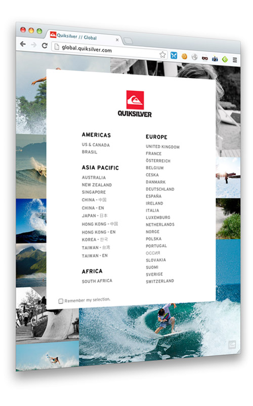
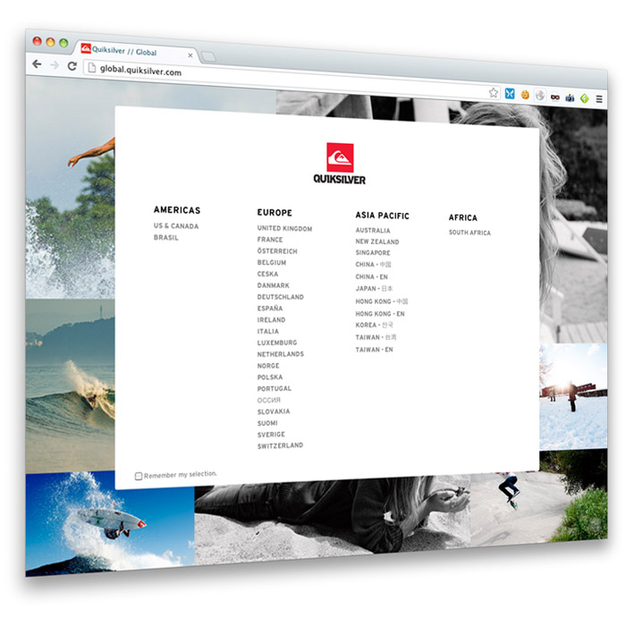
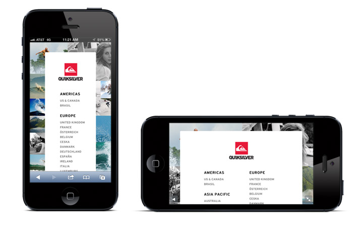
This week we recently launched a new Quiksilver Global Page. The cool feature of this is that we made it responsive, meaning that any way you view the page, from landscape to portrait, thin or wide, desktop or mobile, it’ll look good. I was debating on if I should use a reactive framework like Skeleton JS or Bootstrap or Foundation, but I opted to just write it from scratch. Too many people rely on frameworks I think without knowing what actually is going on, so I find it fun to write the actual media queries for things.
The site has 2 backgrounds
- Portrait Background
- Lanscape Background
The site has 3 views
- Full View
- Medium View
- Thin View
Should you choose to resize your browser, it’ll adjust. However the main idea here is that the site is not built for ‘mobile’, its built for anything. Rather than decide which devices get which code (and potentially duplicating code altogether), we use a single template, single JS file, and single CSS file that all has the reactive code in it. That way if I need to add in a new country, i just have to add it once, and the site will react accordingly.
URL: http://global.quiksilver.com
The thin view after the jump…
The thin view (and theres even a THINNER view)
Update: Title updated from ‘reactive’ to ‘responsive’, my bad


